
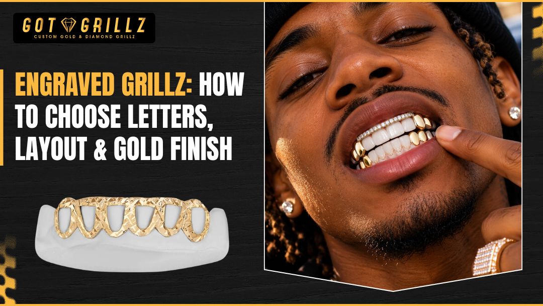
Engraved grillz give you a way to turn a bold accessory into personalized jewelry that carries a name, phrase, initials, symbol, or other detail chosen for a reason.
The challenge is deciding how many letters to use, where the engraving should sit, and which gold finish will keep the design readable without making the piece feel too busy.
At GotGrillz, planning engraved grillz is easier when you separate the design into three parts: the message, the layout, and the finish.
This guide explains how open face grillz, double cap grillz, lettering styles, surface space, and gold appearance affect the final result so you can plan a piece that looks intentional before it is made.
Start With the Message You Want Engraved
The best engraved grillz designs usually begin with a clear idea rather than a particular font. Before comparing finishes or sketching the layout, decide what the engraving should communicate and how prominently you want people to notice it.
A short set of initials may be designed to feel subtle, while a word or phrase may need to become the visual center of the piece.
Choose Words That Fit the Wearing Experience
Shorter text is often easier to read on engraved grillz. Initials, a nickname, a meaningful date, or a compact phrase can give the design personality without covering every visible surface.
Longer wording may still be possible, but it usually requires smaller lettering, abbreviated text, or a layout that spreads the message across multiple teeth.
Think about how the piece will be viewed. Someone looking at a grill from several feet away will notice the overall silhouette and contrast first. Someone standing close will see the details.
If the message only makes sense when viewed up close, that can be a deliberate choice. If readability matters from a distance, fewer letters and stronger spacing generally help.
A useful test is to write the message in three versions: the full wording, an abbreviation, and initials. Then ask which version still feels personal without forcing too much information into a small area.
For example, a long name might work better as a nickname or two initials, while a meaningful phrase may be reduced to one distinctive word.
Consider Meaning, Permanence, and Future Taste
Engraved grillz can feel more personal over time because of the message you choose, but personal taste can change. A timeless initial or symbol may remain versatile, whereas a current slogan, trend reference, or highly specific date may feel less relevant later.
Neither option is automatically better. The important question is whether you want the piece to document a moment or remain part of your regular rotation.
Consider pronunciation and spelling before approving the design. Double-check capitalization, punctuation, numbers, and any special characters.
A small spelling error is especially noticeable when the text is the main feature of the grill. If the design uses initials, confirm their order and whether periods or separators belong between them.
The same applies to symbols. A heart, star, cross, crown, lightning mark, or custom icon can make a short engraving more expressive, but symbols also consume space.
A good engraved grillz design does not simply add every meaningful element. It gives the most important element room to be seen.
Match the Message to Your Style
Personalized jewelry ideas can be understated, graphic, playful, or highly expressive. Your message should match the way you expect to wear engraved grillz.
If your everyday jewelry is clean and minimal, small initials with a polished finish may feel more natural than oversized lettering. If your style is more dramatic, a larger word, repeated pattern, or contrasting surface may make sense.
Look at the rest of your jewelry before choosing the engraving direction. A grill with lettering can coordinate with a nameplate, pendant, ring, or chain without copying those pieces exactly.
Repeating a letter shape, symbol, or finish can create a cohesive look. On the other hand, making the grill completely different from your other jewelry can give it a stronger identity.
At GotGrillz, the most productive engraved grillz design conversations usually start with the customer’s intended look, not just a request for “something unique.”
Bring the words, initials, reference sketches, or general mood you have in mind, then evaluate how those ideas translate to the available surface and the way you plan to wear the grill.
How Should You Choose a Layout for Engraved Grillz?
The layout determines whether engraved grillz feel balanced or crowded. It also depends on the grill style, the number of teeth covered, the visibility of the front surface, and whether you want the letters to be the first thing people notice.
There is no universal layout that works for every design, so the right choice starts with the structure of the piece.
Single-Tooth, Centered, and Across-the-Front Layouts
On engraved grillz, a single-tooth layout places a letter, number, or symbol on one prominent tooth.
This works well for an initial or a compact emblem, especially when you want the engraving to feel like a detail rather than a full statement. The surrounding metal becomes part of the design, giving the mark more visual breathing room.
A centered layout positions the word or symbol in the middle of the visible grill. This approach can create a clear focal point, particularly when the grill covers several front teeth.
Centering helps the design feel intentional, but the letter size and spacing still need to account for the shape of each tooth and the natural curve of the smile.
For engraved grillz, an across-the-front layout distributes letters over multiple teeth or across one continuous visible area. It can suit a nickname, short word, or initials with separators.
The key concern is continuity. If each tooth carries a separate letter, the design should still read naturally when the teeth are viewed together and when the mouth is relaxed.
Open Face Grillz and Engraving Space
Open face grillz leave part of the tooth visible through the design. That open area can create contrast between the tooth and the metal, but it also reduces the uninterrupted surface available for lettering.
Engraved grillz with an open face design often work best when the text is compact, placed on a defined metal border, or combined with a small symbol.
Because the tooth remains part of the visual composition, an open face style can make the engraving feel lighter and more graphic.
It may be a better fit if you want personalization without covering the entire visible surface. However, the open areas can also make a long word harder to read if the letters compete with the exposed tooth.
Ask to review the proposed placement as a complete design rather than judging the letters alone. A phrase that looks clear on a flat sketch may feel different once the open spaces, tooth shapes, and curvature are included.
Double Cap Grillz and More Visual Weight
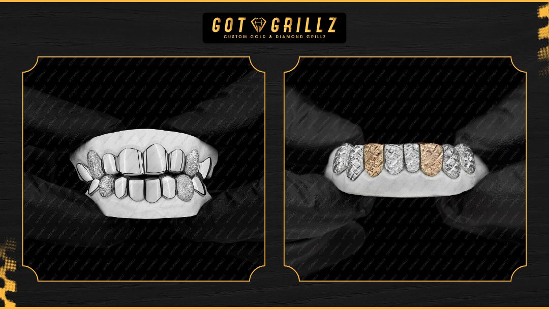
Double cap styles for engraved grillz cover two rows or provide a more substantial layered appearance, depending on the design. They create additional visual depth and may offer more room for a larger graphic treatment, but that does not mean every available surface should be engraved.
With a double cap style, decide whether the engraving belongs on the upper surface, lower surface, both, or only one focal area.
Repeating the same lettering on both levels can create symmetry, while using one surface for text and the other for texture or stones can produce stronger contrast. The best choice depends on whether you want the piece to look coordinated, dimensional, or deliberately asymmetrical.
More coverage also means more visual information. If engraved grillz already include a bold silhouette, stones, cutouts, or sculpted details, a restrained engraving may be more effective than adding large lettering. A design can be customized without every feature competing for attention.
Check Spacing, Orientation, and Proportion
Letters on engraved grillz need enough separation to remain recognizable. Tight spacing can make neighboring characters merge, especially in ornate fonts or on reflective gold. Excessive spacing can make a short word look disconnected.
Proportion matters too: lettering that is too small may lose definition, while lettering that is too large can dominate the grill and reduce the impact of its shape.
Orientation is another practical consideration. Straight lettering may feel clean and legible. Curved lettering can follow the contour of the grill and make the design feel integrated, but it requires careful planning so the text does not appear tilted or uneven.
Vertical layouts can work for initials or short marks but may be less immediately readable.
Before approving a layout, review it at full size and from a normal viewing distance. Ask whether the letters still look balanced when the grill is worn, not only when it is shown as a flat image.
Compare Fonts, Lettering Styles, and Custom Grillz Designs
For engraved grillz, the font is not a separate decoration added at the end. It changes the personality, readability, and perceived size of the engraving.
A strong custom grillz design uses a lettering style that supports the message and the available space instead of choosing the most elaborate option simply because it looks impressive in a sample.
Block, Script, Gothic, and Custom Letterforms
On engraved grillz, block lettering is usually direct and easy to read. It can work well for initials, short names, numbers, and designs where the message needs to be understood quickly.
Its simple structure also tends to pair naturally with geometric grill shapes and clean open face patterns.
Script lettering feels more fluid and personal. It can resemble handwriting or a signature, making it suitable for names and expressive words.
The trade-off is that thin strokes and connected characters may lose clarity when reduced to a small scale. Script is most effective when the word is short and the letterforms have enough room.
Gothic or ornamental lettering can create a dramatic, historic, or streetwear-inspired appearance. It adds visual character, but dense letterforms may require more spacing and stronger contrast.
If your engraved grillz include stones or detailed metalwork, a simpler version of the lettering may keep the overall design from becoming difficult to read.
Custom letterforms can combine features from several styles. For example, a designer may use block capitals with one distinctive curved character or build a symbol into the first letter.
This approach can make the piece feel more original, but the design still needs to be judged for clarity and production practicality.
Choose Contrast Before You Choose Complexity
Engraved grillz are easiest to appreciate when the lettering contrasts with the surrounding surface through depth, texture, shadow, color, or finish. Highly polished gold reflects light, which can make shallow or fine details appear less distinct from certain angles.
A textured or contrasting treatment may make the letters easier to see, while a uniform polished surface can create a more subtle effect.
The goal is not always maximum contrast. Some customers prefer engraving that becomes visible only when the light catches it. Others want the message to stand out immediately.
Tell your designer which experience you prefer because “engraved” can describe very different visual results depending on depth, surface treatment, and surrounding details.
Balance Lettering With Other Design Features
Engraved grillz can include more than words. You may be considering stones, cutouts, a two-tone appearance, a sculpted edge, or a particular tooth shape. Treat each element as part of one composition.
If the letters are the focal point, supporting details should frame them. If the grill’s silhouette is the main statement, the engraving may work better as a secondary accent.
A common mistake is to combine a long word, large stones, a complex font, and an elaborate outline on a small visible surface.
Each feature may look appealing by itself, but the combination can make the final engraved grillz design feel crowded. Removing one element often gives the remaining details more impact.
Try describing the design in one sentence before finalizing it: “The initials are the focal point, with a clean border and a warm gold finish,” or “The word is bold, while the surrounding details stay restrained.”
If you cannot explain the hierarchy, the design may need another round of editing.
Use a Design Proof as a Decision Tool
A design proof for engraved grillz should help you evaluate more than spelling. Review the scale of the letters, the relationship between teeth, the negative space around the engraving, and the appearance of the proposed finish.
Look for areas where a letter could be hidden by the natural contour or where a symbol may be mistaken for another character.
It is also useful to compare two or three versions that change only one variable. For example, review the same initials in block and script lettering, or compare centered placement with an across-the-front arrangement.
Limiting the change makes the trade-off easier to understand than reviewing several completely different concepts at once.
How Do Gold Finish and Grill Construction Change the Look?
Gold finish affects the mood and visibility of engraved grillz, while construction affects how the design sits on the teeth and how much space is available for personalization.
These choices should be made together. A finish that looks subtle on a simple single-cap design may read differently on a layered grill with a larger surface area.
Polished, Satin, and Textured Appearance
A polished finish reflects more light and can give engraved grillz a bright, high-shine appearance. It often suits clean lettering and bold silhouettes, but reflections can make fine engraving harder to see from certain angles.
If you prefer a crisp, noticeable word, ask how the lettering will contrast with the polished background.
A satin or brushed appearance diffuses some light and can create a softer, more understated look. It may help the engraved area feel more integrated into the piece rather than appearing like a separate mark.
This finish can pair well with minimalist initials, simple symbols, and designs where texture is part of the appeal.
Textured surfaces add visual depth and can make engraved grillz feel more substantial. However, texture around small lettering may compete with the characters if both are highly detailed. In that situation, a smoother area behind the text can provide a cleaner reading field.
These terms describe appearance, not a guarantee of how the piece will look in every setting. Indoor lighting, sunlight, photographs, and movement can all change the way gold reflects. Evaluate the finish as part of the complete design rather than choosing it from a name alone.
Match the Finish to Your Maintenance Habits
Like other wearable jewelry, engraved grillz benefit from careful handling, and detailed surfaces need attention when they are cleaned.
Residue, makeup, food particles, and everyday buildup can reduce contrast and make small engraved details appear less clear. Follow the care guidance provided for your specific piece and avoid using unverified household chemicals or abrasive materials.
Think about where you will wear the grill and how often you will remove it. A high-shine finish may appeal to someone who enjoys maintaining a bright appearance, while a more subdued surface may better suit someone who prefers a lower-maintenance visual effect.
This is a style and use decision, not a promise that one finish will stay unchanged.
Engraved grillz should be treated as removable jewelry rather than something to wear continuously. When they are not being worn, storing them separately can help reduce scratches and contact with other pieces.
General oral hygiene remains important, and any discomfort, unusual pressure, or concern about fit should be handled with appropriate professional advice.
Think About Fit Before Adding Detail
Beautiful engraved grillz cannot compensate for a poor fit. The grill must be planned around the intended teeth and the wearer’s individual situation. A design that appears balanced in a rendering may need adjustment when the actual tooth contours, spacing, or bite are considered.
Do not assume that a design made for one person will translate directly to another person’s smile. Even similar layouts can require different proportions. This is one reason custom ordering should begin with accurate information and clear communication about the intended coverage.
If you have dental work, discomfort, sensitive areas, or questions about whether a removable grill is appropriate for you, consult a qualified dental professional. Jewelry design guidance does not replace dental evaluation, and a jeweler should not diagnose oral or orthodontic conditions.
Plan for Photos as Well as Real Life
Many people discover engraved grillz through photographs, but cameras can exaggerate shine and contrast. A polished surface may look brighter in a studio image than it does in normal indoor light.
Fine letters may also appear sharper in a close-up than they seem at a conversational distance.
When reviewing a design, imagine three situations: a close-up photo, a normal face-to-face view, and the way the grill looks when you are moving or speaking.
If engraved grillz only look right in one of those settings, decide whether that is acceptable for your intended use. A wearable design should make sense beyond the product image.
What Should You Confirm Before Ordering Custom Engraved Grillz?
The final stage of ordering engraved grillz is less about adding more ideas and more about removing uncertainty.
A clear order conversation should establish what will be personalized, where the engraving will appear, how the letters should look, and what finish supports the intended style. Taking a few minutes to confirm those details can prevent avoidable revisions.
Prepare a Simple Design Brief
A useful design brief for engraved grillz can be short. Include the exact text, capitalization, preferred font direction, desired placement, number of teeth, finish preference, and any symbols or supporting details.
Add a sentence describing the priority, such as “readability matters more than ornament” or “the initials should remain subtle.”
If you have inspiration images, use them to explain a feature rather than asking for an identical copy. You might point out the letter width, spacing, border, or level of shine you like.
Original custom work is easier to plan when the reference communicates design qualities instead of replacing the design process.
Keep a final version of the text in writing. Read it character by character before approving the proof, including numbers, apostrophes, accents, and spaces. This is especially important when the engraving uses a stylized typeface that can make similar characters look alike.
Ask the Questions That Affect the Final Appearance
A productive consultation about engraved grillz should clarify how the lettering will be shown on the proposed grill style, whether the layout changes across multiple teeth, and how the selected finish affects visibility.
You can also ask whether the lettering needs to be shortened to preserve spacing or whether a symbol should be removed to improve balance.
At GotGrillz, custom grillz shoppers can use this stage to explain the occasion, wearing habits, and visual priorities behind the piece.
Someone ordering a first grill may need help narrowing down options, while an experienced collector may already know the preferred font and focus on proportions. The right conversation is the one that turns personal ideas into specifications that can be reviewed clearly.
Do not rely on assumptions about price, production timing, materials, or policies. Those details can vary by the design, current offerings, and order requirements. Confirm the applicable information directly during the ordering process rather than basing a decision on a general example.
Avoid Common Design Mistakes
Most problems with engraved grillz designs come from overlooking scale, visibility, or how different elements work together, rather than a lack of creativity. Watch for these issues:
- Choosing text that is too long for the intended surface and then shrinking the lettering until it becomes difficult to read.
- Selecting a highly detailed font without allowing enough spacing between characters or across separate teeth.
- Adding stones, symbols, borders, and multiple finishes before deciding which feature should lead the design.
Another engraved grillz design mistake is approving a layout only from a flat front view. Ask how the engraving follows the grill’s curve and how it will look when the mouth is naturally positioned.
The visual center of a drawing is not always the visual center of a worn piece.
Make the Next Step Specific
Once the wording, layout, and finish are clear, the next step should be straightforward: provide the required information, review the proposed design, and confirm the details before production.
Avoid rushing simply because a concept feels exciting. A short pause for proofreading and proportion checks is part of good custom jewelry planning.
If you are undecided between open face grillz and a fuller covered style, compare the amount of visible metal, available engraving space, and overall visual weight.
If you are deciding between single-cap and double cap grillz, compare how much detail your smile and personal style can comfortably support. For engraved grillz, these comparisons are more useful than choosing based on a label alone.
Wrapping Up
Engraved grillz work best when the message, layout, and gold finish support one another. Start with wording that has personal meaning, then choose a placement that gives the letters enough room.
Open face grillz can create contrast through exposed tooth areas, while double cap grillz can provide a fuller, more layered canvas. Neither is automatically the right choice; the decision depends on the look, coverage, and amount of detail you want.
With engraved grillz, use the font to reinforce the personality of the message, and evaluate polished, satin, or textured appearances based on contrast, lighting, and maintenance preferences. Most importantly, review the design at realistic scale and confirm spelling, spacing, fit considerations, and order details before production.
When you are ready to turn a personal concept into custom grillz, GotGrillz can help you organize the design choices around your intended style and wearing experience.
A thoughtful brief and careful proof review will give you a much stronger starting point than adding details without a clear visual hierarchy.